4good Design Thinking

Every organisation has a web presence and that web presence should be unique. It should convey what an organisation does and all express it’s personality and culture.

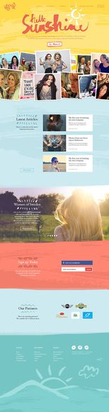
Earlier this year I was asked to contribute some design thinking to 4good. 4good is Swedens largest female network, connecting people and lifting people that can inspire others to fulfil their dreams. They run several Female business networks with success, have their own podcast, do online classes and arrange inspirational seminars all over Sweden.

Ditte Hammarström from Snowfire approached me to help with the redesign of the new 4Good online identity & website design

Design around Identity

To create a unique design for any client, I use their identity as the core inspiration for my design work. I try to create a design that truly reflects their mission, values and culture.

In order to extract a clients identity we need to get to the bottom of who they really are. What drives them? What is their mission? What are their values? We can do this through discussion. In this process it’s important to be empathetic. We need to step into our client’s shoes to fully understand who they are and what they do. We should do this with sincerity and enthusiasm. Look for common threads and patterns. For example, it might be our client repeats the word ’freedom’ when describing their product or organisation. Or they might highlight ‘aspiration’ as part of their culture. These words help us build a picture of our client. They help us understand what is important to them and their organisation. With this information we have a strong basis from which to create a distinctive and unique design.

Characterising 4good

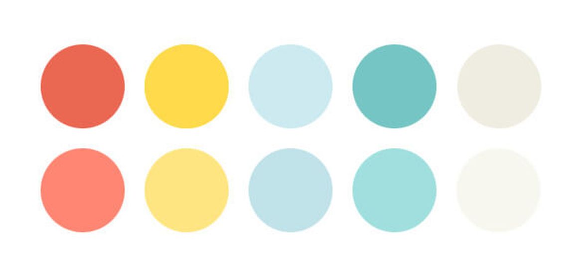
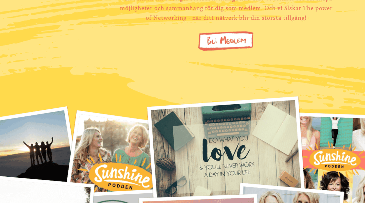
In the case of 4good, I used this information to Characterise the website design. 4good have a strong message; an inspirational message that encourages women to fulfil their dreams and to inspire others to do the same. I wanted to echo this message through the application of style on the site. The colour, texture, typography, iconography, photography and layout can all help to convey this message.

Colour:

The 4Good colour palette is a collection of colours that are vibrant, strong and expressive. They are not traditional/ stereotypically feminine colours but a unique collection of colours that reflect diversity, strength, passion, empathy and compassion.


Texture:

I brought  a number of textural elements to the 4Good design. I’ve used hand painted horizontal dividers on the site and large, textural painted strokes in the background. I’ve used these to help convey the sense of freedom, expression & aspiration that the 4Good brand has attributed to it. This styling combined with the colour palette creates a solid foundation for visual design.


Typography:

I chose two main typefaces for the 4Good site. Firstly, I picked ‘Hoefler Text’ for general titles and body text. This is a self assured yet elegant typeface that I feel fits with the nature of 4Good. For actionable and subtext text such as buttons and the navigation I’m using ‘Gotham Medium’ which feels more functional in comparison to ‘Hoefler Text’, which is why I think it’s a good choice for actionable text.

As a one off set piece I hand painted the main ‘Hello Sunshine’ headline text on the homepage. This is the hero image and deserves this attention.

Iconography:

To highlight ‘title text’ and to add a decorative element that expresses the personality of 4Good, I created some hand painted flourishes that express the spontaneity & spirit of 4Good members.

Photography:

The photography used on the site is all about the women that make 4Good what it is. 4Good supplied me with a great selection of pictures for the homepage that truly express the fun, the enthusiasm and ambition of the 4Good community.

Layout:

The is designed for optimal readability. It’s not a radical layout and it doesn’t need to be. It’s all about the content and stories from the 4Good community. 

Our overall aim was to strike a balance between form and function. We wanted to convey the excitement of what it is to be a part of 4Good’s ever growing community. We tried to convey the personality and aspirations of a group of passionate women in 2016. I think the final result achieved this.


Mike is a UK based designer, specialising in Branding, Graphic/Web Design, Illustration & Photography. He has a worldwide client roster and his work is often featured in design related publications. Mike is also a regular speaker at design/tech conferences. https://www.mikekus.com/