View all the winners!
With thousands of websites created in Snowfire and over 30 websites in the finals, the jury hasn't had an easy task. Below, the winner who swept the competition is presented, along with the top ten websites with the highest scores when all categories are combined. Check out the different categories and read the jury's verdict.
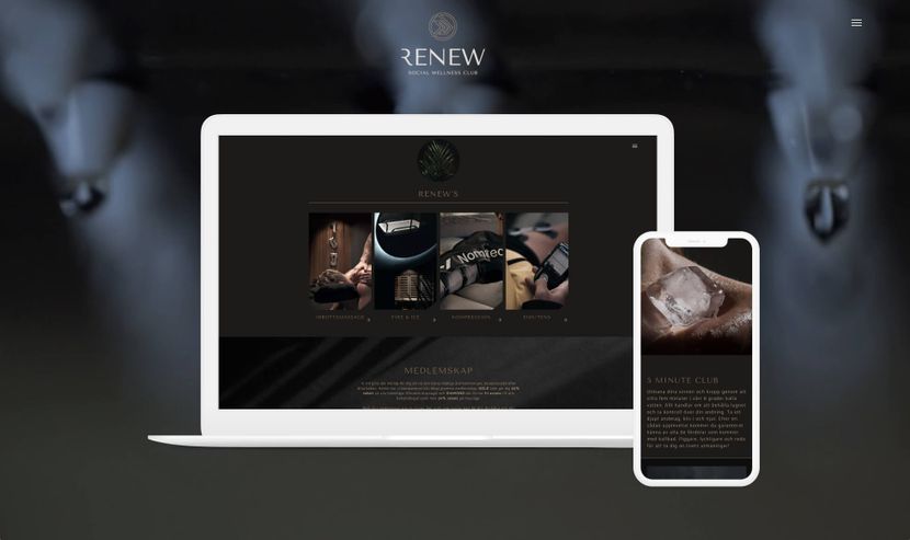
1. Renew Sweden
The entire website conveys a feeling that makes visitors want to stay on the pages. The sleek design entices visitors to explore further with easy-to-understand information placed in the right spots. The website is carefully balanced with the necessary amount of text and images that create an atmosphere and speak for themselves.
Check out the interview and peep the pics with Oskar Jirdell, the owner of renewsweden.com
Jury's verdict
Ten designers from Sweden, Portugal, and Finland,
all members of the Designcommunity, evaluated the entries based on four criteria: Design Experience, Usability, Copywriting, and Target Group Adaptation. The jury was not allowed to vote on their own design or their own clients.
Top 10, 2022
1. Renew Sweden
The entire website conveys a feeling that makes visitors want to stay on the pages. The sleek design entices visitors to explore further with easy-to-understand information placed in the right spots. The website is carefully balanced with the necessary amount of text and images that create an atmosphere and speak for themselves.
Website: Renew Sweden
Design: Becc Designstudio
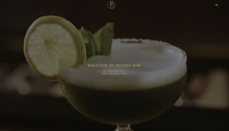
2. Blenda bar
The presentation of the concept on the website creates a mysterious feeling, making you as a visitor curious to visit Blenda Bar. Here we see elegant lounges and learn that taste is paramount. Everything you drink at the bar is available with or without alcohol. The language is English only.
Website: Blenda Bar
Design: Becc Designstudio
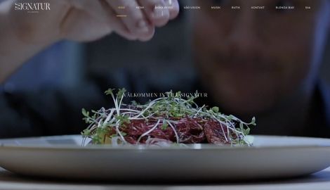
3. Restaurang Signatur
A video right at the start catches the eye and sets the right mood. Here, you get to follow the entire process up to a finished plate "mise en place." There's humor on the pages with chefs hiding behind frying pans. It's a stylish way to view the menu on the site. Booking a table is simple.
Website: Restaurang Signatur
Design: Becc Designstudio
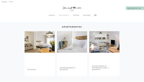
4. You and the Sea
The website feels so well thought out with fun details and beautiful symbols. The color choice is bold. The matte green tone is very surf-like, which fits since this is a hotel for surfers. The sea environments and colors create high expectations. There are clear descriptions of what the rooms look like and how the booking process works, setting an example for booking sites.
Website: You and the Sea
Design: Atelier Maldonado
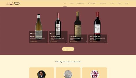
5. Prioraty Wines
The first thing you see is the saturated, pleasant colors that create a wine atmosphere. The site itself is easy to navigate. Here, local growers are highlighted with their own stories. The bottles are nicely presented, making it easy to find wine. Good flow leading to the Systembolaget (Swedish alcohol retail monopoly) for easy booking. The website is well-crafted and well-optimized for search engines.
Website: Prioraty Wines
Design: Aforisma
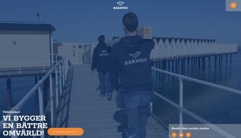
6. Karaten
It feels like this is a large corporation. With a video at the top, it's quick to understand what the company does. Featuring the latest design elements, such as a frosted glass feel on blog posts and cool colors, the company feels edgier than typical construction firms. They seem to be growing and are looking for people.
Website: Karaten
Design: Beegleton
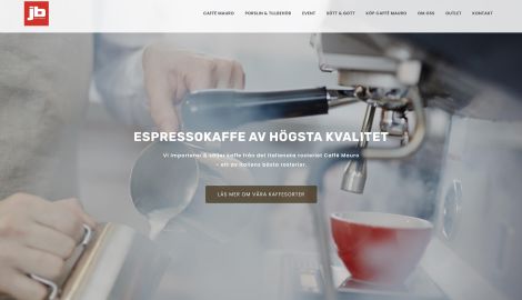
7. JB Coffee House
The video is delicious here. The website is clear, and it's easy to gather information even though it's a large page with a multitude of different coffee brands. Each coffee brand has a subpage, resulting in many pages in total, which is an advantage here. With so many subpages, where they tell and write about each type of coffee, you understand that they know their coffee.
Beautiful cans and images of coffee in all forms are displayed. Caffé Mauro's history creates a thread back in time with pictures from the past.
Website: JB Coffee House
Design: Digital Guidance
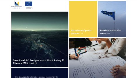
8. Swedish Incubators & Science Parks
The website exudes innovation and stands out from the crowd with its unique design that withstands the test of time. The website playfully uses Swedish colors, giving a distinct Swedish vibe. The site feels easy to navigate even though it's an industry organization with many members.
Webbsite: SISP
Design: SISP
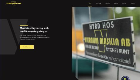
9. Vernum Maskin
In an industry that might not always be considered particularly exciting, this page stands out and arouses interest and engagement. The website has an aesthetically pleasing design that not only looks attractive but also clearly communicates that it's about road signs.
The luscious colors are well chosen to associate with this specific product category and give the website a distinct look that stands out from other similar companies.
Webbsida: Vernum Maskin
Design: Beegleton
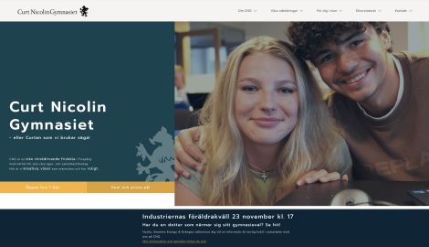
10. Curt Nicolin Gymnasiet
Here, visitors are greeted by fun, modern colors. The page is efficient and informative. It feels targeted towards the students. Images are displayed irregularly across the page with a fun twist, creating a sense of mischief and creative joy.
Webbsida: Curt Nicolin Gymnasiet
Design: Beegleton
Winners in the four categories
Usability
JB Coffee House
The video is delicious here. The website is clear, and it's easy to gather information even though it's a large page with a multitude of different coffee brands. Each coffee brand has a subpage, resulting in many pages in total, which is an advantage here. With so many subpages, where they tell and write about each type of coffee, you understand that they know their coffee.
Beautiful cans and images of coffee in all forms are displayed. Caffé Mauro's history creates a thread back in time with pictures from the past.
Website: JB Coffee House
Design: Digital Guidance
Copywriting
Renew Sweden
The entire website conveys a feeling that makes visitors want to stay on the pages. The sleek design entices visitors to explore further with easy-to-understand information placed in the right spots. The website is carefully balanced with the necessary amount of text and images that create an atmosphere and speak for themselves.
Website: Renew Sweden
Design: Becc Designstudio
Target group adaptation
Selin Arkitektbyrå
The website is clear and immediately provides information about what the page is about. The images are finely tuned in image editing programs. The white background creates a clean surface. The black drawings signal security. The website builds trust by showcasing previous work. The buildings speak for themselves. There are well-photographed images of architect-designed houses.
Webbsida: Selin Arkitektbyrå
Design: Beegleton
Design experience
Renew Sweden
The entire website conveys a feeling that makes visitors want to stay on the pages. The sleek design entices visitors to explore further with easy-to-understand information placed in the right spots. The website is carefully balanced with the necessary amount of text and images that create an atmosphere and speak for themselves.
Website: Renew Sweden
Design: Becc Designstudio
Snowfire Design Awards
The Snowfire Design Awards celebrate what designers, developers, and marketers create together. It's a seal of quality for our work in creating secure business hubs for entrepreneurs who want to attract more customers through their websites.
The 2022 Snowfire Design Awards have come to an end. Nominations for the 2023 awards will open in the fall. A big thank you to all customers and designers who submitted their entries.